Concept project
Education platform
Overview
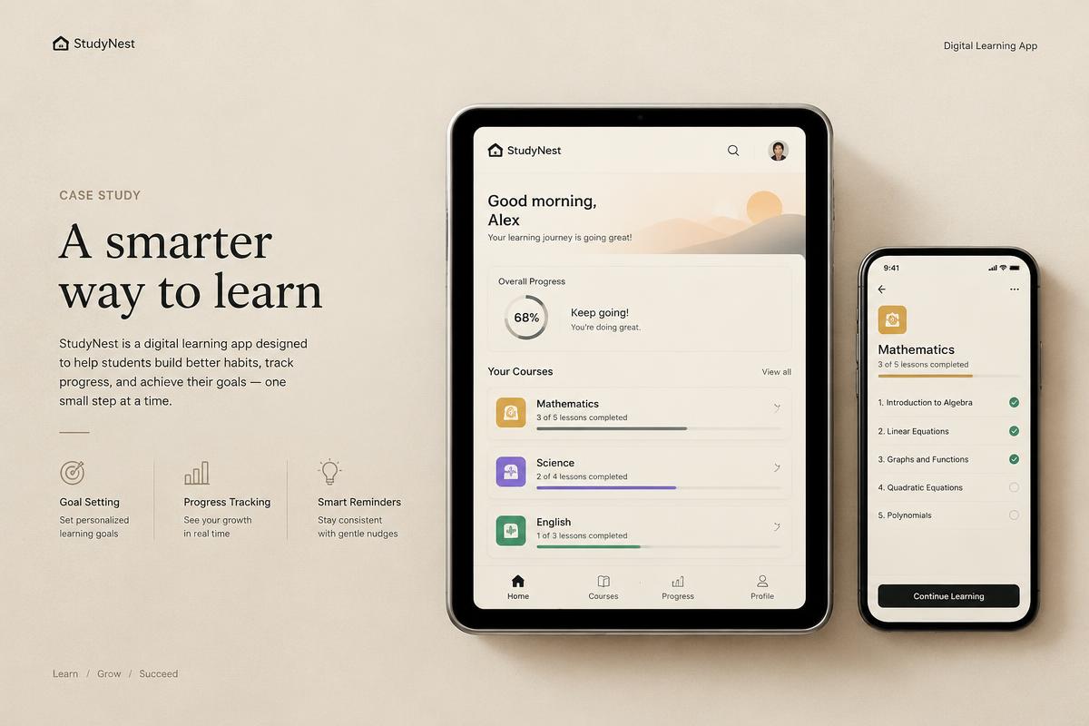
A digital learning and assessment experience.
Context
EdTech · Tablet & mobile
Disciplines
UX, UI, Prototyping
01Challenge
Explore how a learning and assessment platform could feel calm and legible for students and teachers, where complexity usually leaks straight into the interface.
02Strategy
Start from the moments that matter most to students and teachers, reduce each flow to its essential decisions, and let structure do the work that decoration usually tries to do.
03Research
This concept is grounded in desk research and heuristic review of common patterns in the category. No user data or client research was involved.
04Concept
A single organising idea: every screen should answer one question clearly before offering the next.
05Visual direction
Restrained typography, a warm neutral base and one decisive accent colour reserved for action and state.
06UX
Task flows were mapped end to end, with progressive disclosure for advanced options and clear recovery paths for errors.
07UI
Interfaces built on an 8-point grid, with type scale and density tuned separately for mobile and desktop.
08Design system
Tokens for colour, type, spacing and motion feed a compact component library with documented usage and accessibility notes.
09Prototype
Key journeys were assembled as clickable prototypes to test pacing, hierarchy and transitions.
10Outcome
A concept that demonstrates an approach, not a measured result. It exists to show how we think, not to claim business impact.
This is a concept created by Design.sa for demonstration. It does not represent a real client or measured outcomes.
Next concept
AI product